Sunday, 9 September 2007

SKY MOVIES COMMERCIAL

Agency: WCRS


This ad is another example of what a great source of inspiration travel can be. It was filmed in Sao Paulo where all forms of outdoor advertising (including shop fronts) have been banned by the City’s Mayor. As a result São Paulo has been left with numerous empty billboard structures, which without their signage appear ghostly and oddly beautiful.

The ad pans across the city taking in the empty billboards, whilst accompanied by Gene Wilder singing ‘Pure Imagination’ from Willy Wonka & The Chocolate Factory. It ends with the line “Because you like movies with no interruptions, we took away the ads”.

The slow and tranquil feel of this ad is in stark contrast to the banned high-impact advertisements which were designed to grab your attention. Although this does make for a beautiful piece of film, I don’t think it effectively promotes the idea that a world without adverts would be a better place. Instead, Sao Paulo appears dead as if the banned adverts have taken with them all the life and excitement of the city.


Above: Before the Sky ad was made, Tony de Marco, who described the banned adverts as his “visual enemies”, created a series of epic photographs of the empty billboards. Home Corp, the Production Company behind the Sky advertisement, were so impressed by De Marco’s shots that they approached him to advise them on their shoot. More of his photographs can be viewed online at: www.flickr.com/photos/tonydemarco.

Monday, 13 August 2007

SHE-BEAR LINGERIE


Agency: TBWA Hunt Lascaris, Johannesburg.

I really like this ad. It’s provocative, fresh and very current. Graphically it looks great as well, with three Muslim women fully covered in black carrying white bags of erotic lingerie.

Maybe its underlying message is: She-Bear lingerie liberates you.

I find it interesting that the ad comes from Johannesburg where maybe the culture is less ‘politically correct’ than in the UK. I wonder how effective it would be, as an ad, if it were to be used here.

MARTINI


(Shaking this ad makes the Martini logo visible.)
Agency: McCann Erickson, Geneva

This is one of the cleverest print ads I’ve seen. The optical illusion allows the viewer to physically interact with the static printed ad.

By involving the viewer in this way they are more likely to remember the advertised brand and show it to others, purely because it is so clever.

CAREER BUILDER AMBIENT


Agency: The Martin Agency, Richmond, VA

A very clever use of space: cheap and highly effective. Through using this space they are specifically targeting people in office blocks (their target market).

This advert could easily catch the viewer’s attention, as no other adverts are fully visible from this viewpoint. Also, the unusual use of space adds to the impact of the joke.

The success of this ad makes me think about other places, which could provide new advertising opportunities. When I do think about it, the potential of ambient media is limitless and I think it’s just a matter of time before the advertising industry starts feeling confident enough to use it more often and exploit that fact.

Thursday, 2 August 2007

CHUNGKING MANSIONS


“There is probably no other place in the world like Chungking Mansions, the budget accommodation ghetto of Hong Kong. This huge ramshackle high-rise dump is almost a city in itself.
You may be put off by the undercurrent of sleaze and peculiar odours- a potent mix of cooking fat, incense and shit- but don’t seek sanctuary in the lifts; they’re like steel coffins on cables.
Adding to the excitement are the midnight raids by Hong Kong’s boys in blue. For the most part the police are looking for illegal immigrants: have your passport ready.”

Source: Lonely Planet; Hong Kong & Macau

After reading this description of where I was going to be staying alone, on the plane flying over to Hong Kong, I was expecting the worst. However, when I arrived there, I was relieved to find that although it was crazy, it wasn’t quite the hell on earth that my guidebook had described.

Although it was late, inside the building was a hive of activity. There were market stalls, restaurants, hairdressers, tailors and lots of loitering touts and street workers. The place had a strangely appealing dangerous energy about it and although I was very wary of it, I was definitely excited to be there.

Sunday, 22 July 2007

TATE MODERN


Although I enjoyed the Tate Modern, it didn’t quite live up to my expectations. Although the scale of the building was impressive, I found parts of the building to be soulless and ironically quite dated in appearance.

Overall though, I did see a lot of work which I found to be exciting and inspiring (although there was also a lot of work which came across as annoyingly pretentious) and I will go back to see the bits I missed.

THE ART DIRECTION BOOK

D&AD asked 28 of the world's top art directors to talk about their craft. They published the results and examples of their work in this book.

The examples of work included aren’t particularly inspiring as they do look a bit dated (the book was published in 1996), but the advice given is still very relevant.

The three pieces of advice that recur throughout the book are: 1. If you want to be the best work with the best. 2. Keep it simple; don’t be distracted by fads and fashions. 3. Get a life outside art direction.

Other pieces of great advice include:

“Even the most radical work should be easily justified”

“It is easy to do something that looks different or something that looks relevant. Doing both is the tricky bit.”

“If you know what you’re doing you can’t be doing anything original”

“It’s more difficult being wrong than right.
If you want to be right, just do it the way everyone else does.
Doing it differently means listening.
The cleaner can improve your ad.
The most junior account handler can.
Your aunt can.”

JUSTIN MORTIMER


Justin Mortimer, a British Artist, born in 1970, creates semi-abstract drawings, paintings and photo-collages. He has won many awards for his work including Young Artist of the year in 1996 and First Prize in the BP Portrait Award in 1991.

The one piece which I am a massive fan of is ‘HM the Queen’ (1997. Oil on Canvas. 135cm x 135cm) The Royal Society for the Arts commissioned this piece to mark the 50th anniversary of its link with the Queen.

I really admire Mortimer for staying true to his semi-abstract style and producing a piece which was obviously going to be controversial and attract a certain amount of criticism.

He describes the piece as “fresh and funky” and says:

"I wanted to get away from the royal aspect and paint a picture of a person rather than the Queen.

It means people can focus more on the abstract quality of the painting and get away from the 'normal' paintings of royalty, where everything is intact and, dare I say it, sycophantic."

I totally agree with Mortimer's way of thinking. There is no point in repeating what’s already been done before.

HONG KONG MUSEUM OF ART


The Hong Kong Museum of Art’s mission is to preserve the cultural heritage of China. Its collections now number in excess of 14,000 art objects, including Chinese paintings and calligraphy works, antique Chinese treasures, paintings of historical significance as well as creations by local artists.

I visited the museum in 2004. The work I was most interested in was from the ‘Vietnam Behind the Lines’ exhibition. This collection featured Communist propaganda posters from the time of the Vietnam War.

It was really interesting to see what the war looked like from the Vietnamese point of view. I was surprised at how similar the posters were to western propaganda posters, both in layout and the messages which they were promoting. They were full of national pride and a ‘dig deep’ mentality. They graphically portrayed the Americans as evil monsters who were attacking innocent Vietnamese people, including women and children.

After viewing these posters I had a much greater sympathy for the Vietnamese people. I suppose this is proof that this type of poster is effective, especially in a war situation. It makes me wonder if the British Government felt it necessary to produce war propaganda posters today, how different would they be to those Vietnamese posters produced all those years ago? My guess is, not much.

ONE PLANET


“The world is a book and those who do not travel read only a page” St Augustine

I think this is so true and for this reason I think travel is definitely one of the best sources of creative inspiration.

One Planet is a celebration of life, curiosity and the experience of travel. It is a collection of quotations and inspirational photographs from around the world.

The stunning photography of real people and places capture things that have to be seen to be believed. For example, the nomadic ‘Sea Gypsies’ from Indonesia (pictured, top) look more like characters from the film Water World.

Saturday, 21 July 2007

BANKSY GREENPEACE POSTER


The beauty of this poster is that it will appeal to everyone from children to the elderly. Most people have seen the Disney film, Jungle Book, probably when they were small and this poster revokes all those feelings you had when you first saw it. We have some kind of emotional attachment to these characters, maybe more than we do to the real-life jungle animals and people, and the thought that someone’s about to take them away from us, provokes a kind of protective reaction.

Visually, I really like the effect of combining a black and white photograph with colourful cartoon drawings. The idea of taking these fictional Disney characters and putting them into the real world in a sinister context, is really quite arresting.

I wonder if it would work better for Greenpeace as a poster though if it displayed their logo in the corner. Although this would take away from the poster aesthetically, it would add weight to the message, making people think more seriously about it, rather than just seeing it as another quirky piece of art by Banksy.

Wednesday, 18 July 2007

LYNX


This is an online viral ad for Lynx. It’s promoting the “spray more, get more” philosophy. It works because it’s such a simple, clever idea. It’s refreshing, as this kind of thinking isn’t usually seen in advertising aimed at the young male market.

It works well as a viral as it’s relatively short. This means people may well be inclined to watch it more than once and send it onto their friends.

In contrast to this viral, the most recent Lynx "naughty to nice" ads that are currently being shown on TV are over-complicated. They are not clever, sexy or cool. This is a shame as in the past Lynx ads have always been so good and spot-on for their target market.

Sunday, 15 July 2007

THIS IS ENGLAND


This is England is a British coming of age drama which gives us with an unbiased insight into the skinhead movement of 1980's Britain.

The film is both gritty and uplifting. Filmed in the Meadows in Nottingham, it is a powerful demonstration of British filmmaking at its best.

The frequent add-libs demonstrate the actors’ natural dry wit and add to the realism that resonates throughout the film. It is moving without being over-sentimental: a trait that ruins many Hollywood films.

My favourite part of the film was the opening credits (similar to the start of the video above), which sets the scene of 1980’s Britain perfectly, capturing the energy and mood of the time. While this might provoke a feeling of negativity, the evocative period Ska soundtrack gives the opening sequence, and indeed the whole film, an optimistic twist.

Sunday, 8 July 2007

WOODHOUSE


Woodhouse is a deprived area of Leeds and as a result has a bad reputation. From a creative point of view though, I find it stimulating.

The large student population gives the place a laid-back, optimistic feel. Day and night, a range of music can be heard echoing from various bedroom windows. It’s full of life.

Visually it is also very interesting. The rows of red brick terraces are full of character and are reminiscent of a bygone era.

In contrast to this, the fly-tipping and the graffiti which springs up over night keeps things fresh and can be a great source of inspiration.

JONATHANYUEN.COM

Jonathan Yeun, a multi-disciplinary graphic designer, has created a self-publicising portfolio website with a difference: it doesn’t feel like a self-publicising portfolio website.

Instead its tranquil, simply animated scrolling pages feel more like a beautifully illustrated children’s book.

The focus of this 'site is not Yeun's portfolio of work, it is the 'site itself, which he uses as a demonstration of his creative talents.

This confident move is what differentiates Yuen’s ‘site from the thousands of other portfolio ‘sites out there.

Saturday, 16 June 2007

WANGECHI MUTU


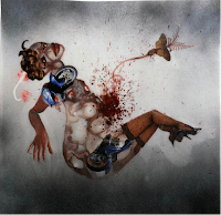
Wangechi Mutu, born in Kenya in 1972, makes alluring yet unsettling pictures of female figures. She uses her work to make bold statements about a variety of feminist and racial issues.

Mutu goes about creating her images by first painting outline images on Mylar. She then starts to build-up the picture using images cut from a variety of printed sources.

In 'Untitled' (pictured above - top), the goddess-like figure is made-up of images cut from fashion magazines, National Geographic and books about African art. It represents the disjointed facets of modern Africa, portraying its inner turmoil, ancient tradition and blossoming future.

In 'Untitled' (pictured above - bottom), Mutu creates a glamorous centerfold type image with a barbaric twist. She combines a motorcycle with female body-parts, implying that women are seen as sex objects and as a result are suffering.

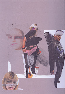
I first became aware of Mutu’s work, when I saw two of her pieces (pictured) as part of The Saatchi Collection at Leeds City Art Gallery. It immediately inspired me to create my own collage (pictured below). I was excited by the thought of mixing lots of different images to create my own surreal, original piece of artwork.

LONDON 2012 LOGO


"Our emblem needs to be modern, bold, flexible and as relevant today as in five years' time.”

“We want our Games to be different. We are hosting them in a different era, in 2012. The emblem needs to work across new platforms that reach young people."

"The new Olympic brand draws on what London has become - the world's most forward-looking and international city.”


The values behind this logo sound very exciting. However, the logo itself, designed by the Wolff Olins agency, is for me, a bit of a letdown as it just misses the mark.

The logo is bold and very different from previous Olympic logos which is great. However, I don't believe it will fully engage young people as it appears too contrived and manufactured. It has no soul, compared to say Jamie Reid’s Sex Pistols record-sleeve and poster designs, which I believe acted in part as inspiration for this design. Rather than appearing modern and edgy, the jagged shapes and bright contrasting colours instead seem to slightly patronise the youth at which it’s aimed. It’s too childish and so not particularly cool.

The Olympic organizers wanted to convey the message, through this logo, that London 2012 will be "Everyone's Games". However, an online petition to scrap the logo already has tens of thousands of signatures. Clearly this aspiration has not yet been reached.

I still think the logo has lots of plus sides though. I like the fact that the logo is flexible and can change colours. This adds personality and life to the brand.

I also admire the fact that the organizers have had the bravery to do something different. It would have been very easy for them to do something safe and ordinary. At least this logo is original and arouses some kind of emotional response.

If nothing else, it’s got people talking about London 2012 and gained lots of free worldwide publicity, which will more than cover the £400,000 cost of developing the design.

Saturday, 9 June 2007

KUNG FU HUSTLE


Kung Fu Hustle is a 2004 Hong Kong martial arts film directed by Stephen Chow.

It is an eccentric vision of an action - comedy - musical – drama and is both a parody and a homage to the kung-fu genre.

Set in 1930s Shanghai, it is a tale of redemption for the central character, Sing, a petty criminal who is trying to join the city's most powerful gang.

Kung Fu Hustle is a film of contrasts. Chow mixes slapstick comedy with dry wit. He sets stylised, over-the-top action against traditional Chinese music. The result of these unusual combinations is one fresh, truly inventive film.

Chow’s Looney-Tunes inspired cartoon-style is heightened to extreme levels by fantasy CGI. This along with Chow's usual assortment of oddball characters and spectacular kung-fu choreography makes for one wild, visually exciting film.

Widely acclaimed for its visual effects, the film was nominated for a Golden Globe. It also went on to become the highest grossing film in the history of Hong Kong and the highest grossing foreign language film in the United States in 2005.